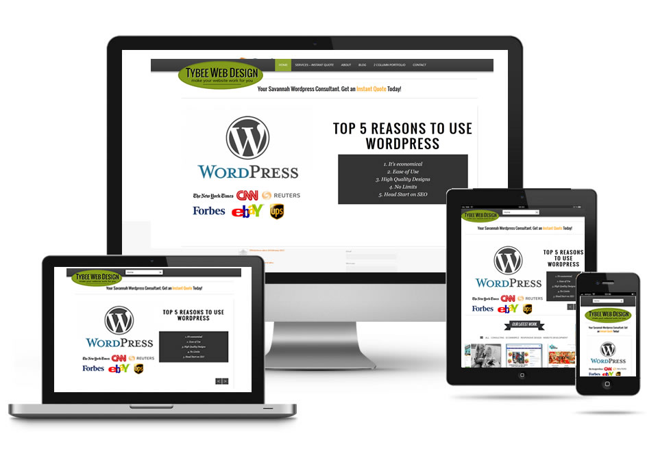
We are completely sold on the concept of Responsive Design. What this means to us is that your website will be easily navigated and viewed on every device. You don’t need to create a mobile website. You don’t really need to create a mobile app unless you need to access some of the functionality that the app will provide. If your website goals are to provide information and web-based tools like contact forms, maps, cost calculators, utilizing a responsive design is your best bet for creating a website that won’t need updating for a long period of time.
is based on creating a clean and clear user interface, creating a fast-loading website, utilizing tested frameworks, and thoroughly testing and keeping up with current trends to provide a robust design that will have the best chance of working well in the future.
Web development and design continually changes by necessity. Every day there is a new device, a new screen. It is next to impossible to keep up with every nuance of all the new software and devices. By using frameworks developed by large groups of experienced developers one has the best chance of working with the best technology. There are so many wonderful frameworks for rapid website developement, but our current choice for responsive website structure is the the Bootstrap Framework and for adding a little creative kick with Javascript.